Denver Broncos blog, news and rumors


FB

[hype it up!]
[Share with Yardbarker]

Published on 03/27/2012 at Tue Mar 27 12:30.
Tagged: ,,,,,,.


Update:  4/3/12:  The team’s new uniform has been revealed!

Are you ready for the orange to return to our beloved orange and blue Denver Broncos?  In one week from today, the Broncos’ uniform will return to being orange-dominated like it was from 1965-1997.

A new era in Broncos history will begin on Tuesday, April 3rd when the NFL and Nike Inc. unveil the league’s 2012 uniforms, previously manufactured by Reebok.  Nike and the NFL have agreed on a five-year deal, making Nike the official apparel provider of the NFL through 2017.

The Broncos, who were granted permission from the league to change their primary jersey color to orange, will be involved in the launching event in New York on the 3rd.  While no drastic ramifications are expected for Denver’s uniform, we expect Nike will tweak the Broncos’ look, even if just slightly.

We don’t know how the uniform will look (other than quite similar to the team’s 2011 alternate orange-based uniforms), but Nike did release images of what the team’s Vapor Jet Gloves will look like (image here).  New Era has also unveiled the team’s 2012 Draft Cap (image here).

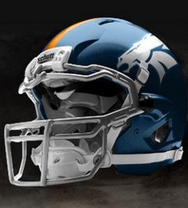
Those creative Photoshop Nike uniforms that have been floating around are not real, and do not necessarily reflect what the Broncos’ new uniform will look like.  Nike will however implement their signature flashy designs to each team’s uniforms — with some team’s ramifications being more drastic than others, per Nike President and CEO Mark Parker.

We’re excited about the return to orange and the possibility of some changes to Denver’s game-day apparel.  Check back next Tuesday for full details on the new Denver Broncos uniform.

  • Craighwk

    Nothing says douchebag like a flat billed cap :(   On a serious note, I am glad you debunked those fake pictures that people STILL think are real.

  • Anonymous

    god, that’s a terrible cap. 

  • Anonymous

     I wish they were real, the white helmet with the old school logo looks bad ass

  • Anonymous

    Whaaaa?!?  I like the theoretical idea of a white helmet, but overall those unis are an abomination against mankind.

  • Anonymous

     I think the artist bringing #7 out of retirement is a true abomination, but agreed, the unis look like something the Oregon ducks would wear. 

  • http://Facebook.com/BroncosZone Jon

    I believe there will be a flat-brimmed hat, as well. 

  • R8terH8ter

    That uniform pic is off the hook!!!! The white helmet with the D on it looks real good…..They make a statement like were gonna make this season…Off to the Championship we go.They should make each hat(3 if I’m correct) available in different colors

  • Samuel

    looks alright you know just a bit to orange though

  • Man_one

    Same thought. That helmet rocks.

  • Man_one

    Terribly beautiful

  • Anonymous

     It reminds me of a storm trooper helmet

  • Anonymous

    I just hate hats with huge logos and too much lettering.  

  • http://Facebook.com/BroncosZone Jon

    I’m not much of a hat guy in general… but I don’t care for that hat, either.

  • Anonymous

    I kinda like the helmet, but I think ultimately sticking with the dark blue is a better way to go.  Just whatever happens, no baby blue!  

    And if you want to see some abominations, just google for the rest of the series of those uniforms and check out teams like Pittsburgh.  Blecch.

  • Anonymous

    I really like the current logo.  Wish they would go back to a more traditional looking uniform (orange of course).  Thinking the jerseys they wore for a couple of years… orange with the wide blue band on the sleeve and number inside that.  very nice and would look great with the current logo too.  

    Thought the white helmet in the picture looked like crap.

  • bleedorange&blue

    You are an idiot if you think the new logo is better looking than the old one, the only reason that a-hole ( Pat Bowlen) changed  from the old logo to the new one was so he could threaten to move the Broncos if he did’nt get his new stadium back in the late 90’s that’s why the D had to go and the old uniforms so what ever state he went to could use the name. I miss the D it felt more like our team back then.. 

  • Anonymous

    And I suppose you  think G Bush planned the 9-11 attacks.  It’s a uniform dude.

  • Anonymous

    How about not calling somebody names because they have an opinion, that is what this board is for so we all express opinions in a friendly environment.

  • Shanekatz

    that white helmet with the old logo is super sweet. I hope that they go for it. I love it. Also the orange jersey with blue 1/2 blue under shirt looks real nice. Not having orange all the way and just the blue sleeves would be bad ass

  • guest

     Every team changed logos and uniforms at the same time stupid, Pat Bowlen had nothing to do with it

  • D Ashman11

    I visit Denver from 22/12/11 to 17/01/12 and now would consider them my favourite NFL team… Whils’t i was their i thought those orange shirts looked sooo much better than the blue, glad they changed to them!

  • broncoinKS

    Horrible style and overall design is significantly lacking. Horrible! 

  • Fetish4speed

    Yes I agree!! Looks sweet!

  • Fetish4speed

    Yes I agree!! Looks sweet!

  • bleedorange&blue

    OH WAAA grow a sack p..ss boy I called him an idiot because he is one, first of all the new logo could never compare to old ones and they only wore the jerseys he talking about for one year the 75th anniv year it was our 60’s through back.

  • bleedorange&blue

    Hey dumb..ss  we were the only in 97 that changed our uniforms and just so you know moron it was well documented that Bowlen changed for the very reason I said, so know what the hell your talking about before you open your mouth !!!!!!

  • bleedorange&blue

    Hey dumb..ss  we were the only in 97 that changed our uniforms and just so you know moron it was well documented that Bowlen changed for the very reason I said, so know what the hell your talking about before you open your mouth !!!!!!

  • bleedorange&blue

    WOW YOU HAVE TO BE THE BIGGEST DUMB…SS YET. WITH A COMMENT AS STUPID AS YOUR’S YOU SOUND LIKE A raiders FAN.

  • Anonymous

    I stand by my original point, it is your opinion which logo is better, not a fact. If someone ignores a clear fact then perhaps calling them an idiot is warranted. You somehow think attacking people gets your point across or makes it more valid? No, you lessen your credibility…by the way, it’s “grow a pair”, it’s spelled “whaaaa”, and it is a throwback not through back.

    ________________________________

  • MiamiMike

    actually you sound like a Raiders fan. how old are you ? By the way you express yourself you sound like a 15 year old. Can’t you just give your point and allow people to give theirs? You have a right to disagree with someone but they in turn have the same right to disagree with you. It does not give them a right to start with the child like negative comments. Most fans here do not need to deal with your comments as well. Grow up act like an adult stop with the temper tantrums and the
    adolescent name calling. It only makes you sound like a person who is off their medication and can’t act like a normal person in group settings

  • S10broncos

    All New Era hats are “flat bill” untill u old people curve em like hill billies

  • Rcsodak

    freakin’ idgit

  • Broncos4Life

    I want to know where we can get those gloves!!!!!!!

  • denvernation1

    haha he said through back. HAHAHAHAHAHA

  • Bortz1985

    so curling a hat makes you a hill billie? I dont understand, just because the new trend is a flat bill dosent make someone who likes how they believe a hat should be, a hill billie or anything else that you deem a derogetory statement