Denver Broncos blog, news and rumors


FB

[hype it up!]
[Share with Yardbarker]

Published on 04/03/2012 at Tue Apr 03 10:47.
Tagged: ,,,,.


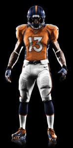
(Image courtesy of Nike Inc.)

The Denver Broncos, NFL, and Nike unveiled the team’s new uniform for the 2012 season and beyond on Tuesday in New York, which drew mixed reactions.  No drastic changes were made to the design of Denver’s uniform, but the material is said to be “cutting edge” and lighter than the team’s 2011 uniform.

Most of the notable changes to the uniform are near the collar of the jersey (closer image here), with the jersey itself looking quite similar to the team’s 2011 orange alternate, as we predicted it would.  Fans have had a mixed reaction to the announcement, as some were expecting more drastic changes.

It should be noted that Nike never hyped up big ramifications to Denver’s uniform design, and those Photoshops that floated around the web were fake and Nike had no association with them.  Those flashy ‘Shops with white helmets and a mix of old-school looks and modern design gave fans false impressions of what the team’s new uniform would look like.

The team’s new look is a bit flashier than 2011’s design, and cornerback Champ Bailey likes them — you can’t argue with him!  According to Buffalo Bills safety George Wilson, the Seattle Seahawk’s new design was the overwhelming favorite among the players.  That may mean we’ll see more Oregon Duck-like uniforms down the road.

Nike is taking over as the NFL’s supplier of on-field and sideline apparel starting this month, a position Reebok had held for the past ten years.  The new jerseys will go on sale Thursday, April 26th — the first day of the 2012 NFL Draft.

What are your thoughts on Denver’s new uniform?  Were you expecting more changes?  

  • Anonymous

    Shouldn’t that be association,  assassination  seems a bit extreme.

  • Anonymous

    I’ve got to say the photoshops were SO much better. This is pretty ho hum boring.

  • Bc_007_316

    Is the close-up of the collar supposed to make it look like they’re wearing gold chains with an NFL pendant or is that just bad lighting?  Either way not sure I’m on board if this is NIKE’s idea of flashier?  Also not quite sure what all the hype was about and the long awaited release for virtually nothing to be different, the new material might make a difference on the field but I would say it wont make much difference to the consumers who mostly will buy replicas probably made of cheaper materials.

  • http://Facebook.com/BroncosZone Jon

    Auto-correct error, forgive me!

  • Anonymous

    The collar looks retarded.   

    It’s time for a complete overhaul.  Keep the colors, eliminate the idiot stripes on the helmet, pants and tops.


  • Anonymous

    I cannot stress enough how bad that collar is. It makes them look like jack-o-lanterns.

    just terrible.

  • Anonymous

    I cannot stress enough how bad that collar is. It makes them look like jack-o-lanterns.

    just terrible.

  • Anonymous

    The collar isn’t the problem–it’s the stripe that necessitates the weird collar design.  Modify that pointed stripe, and there’s no need for weird collar.

  • http://twitter.com/TimLynch1978 Tim Lynch

    I’m just happy to see orange again!!!  Bring back the D on the helmet!  hehe

  • http://twitter.com/TimLynch1978 Tim Lynch

    The Seachickens new look is horrid.  It looke like vomit after a long night of drinking green beer on St. Patricks Day.  #FAIL

  • http://twitter.com/BenDavis07 Ben Davis

    Yeah, the colar just looks plain bad.  I like everything else, it’s what I expected.  Wish there was a little more blue in the design somewhere, but this is exactly what I expected Nike would do.  Only thing that worries me is the price of replicas, and the overall design of them.  If you look at the pictures close up, you’ll see that half of the jersey is a smooth material, with some parts made up of mesh, mostly around the stomach and lower back.

  • Anonymous

    No.  They changed the collar, dude.    

  • Broncos4ever

    Is it me or does the new orange look a bit more like the classic orange crush orange, and less like the retina burning orange of late?

  • Anonymous

    No, what I mean is that they made the color come down like that to “complete” the pointed swoosh (technical term, lol) of the stripe on the side.  With a “normal” sidewall like what, say, NE or BUF have, then we could have a “normal” colored collar.

  • http://Facebook.com/BroncosZone Jon

    It’s not just you, the orange appears to be a little bit of a different shade.

  • Anonymous

    Yeah, I get it, but you’re wrong.  The tips of
    the swoosh stripe don’t touch the collar (see the previous BT post for photos). 

    They simply took the front half of the collar
    and made it orange w/ whatever those stupid bengals looking stripes are.     It’s idiotic.

  • Anonymous

    lol

  • http://twitter.com/TimLynch1978 Tim Lynch

    I love it

  • Anonymous

    haha i like the analogy, but disagree.

  • Anonymous

    nobody likes change

  • http://twitter.com/TimLynch1978 Tim Lynch

    It isn’t that bad, but because they are the Seachickens….screw them.  :)